Strategic Coffee Shop Sales Performance Dashboard
This Power BI dashboard transforms raw coffee shop sales data into strategic insights, helping stakeholders pinpoint opportunities to enhance customer retention and drive profitability.
This Power BI dashboard transforms raw coffee shop sales data into strategic insights, helping stakeholders pinpoint opportunities to enhance customer retention and drive profitability.
It's a well-known fact that acquiring new customers is far more costly than retaining existing ones. Coffee shops rely on loyal patrons for steady revenue, so this project delivers a Power BI dashboard that transforms raw sales data into strategic insights, helping stakeholders pinpoint opportunities to enhance customer retention and drive profitability.
A critical early phase involved developing a thorough understanding of the sales data and ensuring accurate metric calculations. We began by ingesting the Excel sales file into Power BI, creating a robust semantic layer and cleansing the data. Next, individual worksheets were crafted with targeted visuals—daily heatmaps for temporal trends, KPI cards for top-line metrics, bar and line charts for breakdowns by store and category, and decomposition trees for hierarchical analysis. These worksheets were then synthesized into a single, interactive dashboard featuring seamless cross-filtering. The final phase included rigorous validation of data accuracy and UI/UX refinements based on stakeholder feedback.
This document outlines the "Strategic Coffee Shop Sales Performance Dashboard," a Power BI-driven analytical solution designed to deliver comprehensive insights into coffee shop sales. Leveraging an Excel sales dataset, the dashboard integrates sophisticated visualizations, DAX-driven KPIs, and advanced interactive filtering. It serves as a pivotal tool for business users to explore sales trends, identify critical revenue drivers, and make strategically sound, data-backed decisions.
Data Source, Structure & Modeling Highlights:
transaction_id, date & time – unique records and time-series/peak-hour analysis
store_id & store_location – to segment by outletproduct_id, category, type & detail – for drill-downsunit_price & transaction_qty – to calculate revenue and volumesInitial data profiling was conducted during development. The dashboard assumes a good standard of source data quality; however, robust error handling in DAX measures can mitigate minor inconsistencies.
Total Sales = SUM(Transactions[Sales])Date Table = CALENDAR(MIN(Transactions[transaction_date]), MAX(Transactions[transaction_date]))MOM Growth & Diff Sales =
VAR month_diff = [CM Sales] - [PM Sales]
VAR mom = month_diff / [PM Sales]
VAR _sign = IF(month_diff > 0, "+", "")
VAR _sign_trend = IF(month_diff > 0, "▲", "▼")
RETURN
_sign_trend & " " & _sign & FORMAT(mom, "#0.0%")
& " | " & _sign & FORMAT(month_diff / 1000, "0.0k") & " vs LM"new MoM Label =
VAR month_diff = [CM Sales] - [PM Sales]
VAR mom = month_diff / [PM Sales]
VAR _sign = IF(month_diff > 0, "+", "")
VAR _sign_trend = IF(month_diff > 0, "▲", "▼")
RETURN _sign_trend & " " & _sign & FORMAT(mom, "#0.0%")Purpose: Provides a single control to filter all visuals by a Month-Year selector.
Month Year (e.g., "Jun 2025")
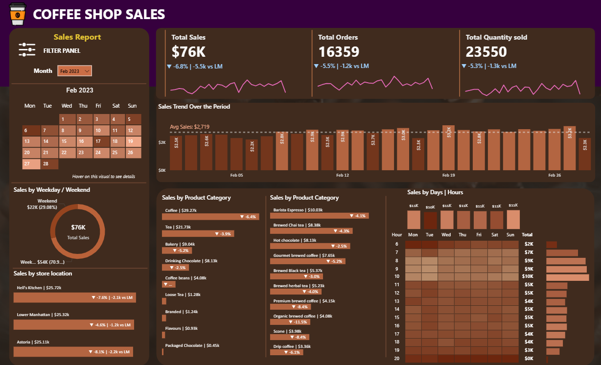
Purpose: Granular day-by-day view of sales to spot daily patterns at a glance.
DayName, WeekNumber, DayNumber,
WeekdaySortKey
.png)
Purpose: Immediate, high-level overview of critical business health metrics: Total Sales, Total Quantity Sold, Total Orders.
CM Sales & PM Sales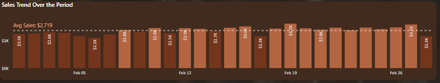
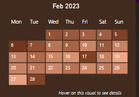
Purpose: Visualize daily sales fluctuations and identify days above or below average.
Daily Avg Sales =
AVERAGEX(
  ALLSELECTED(Transactions[transaction_date]),
  [Total Sales]
)

Colour For Bars =
IF(
  [Total Sales] > [Daily Avg Sales],
  "Above Average",
  "Below Average"
)
Visual: Matrix Heat-Map (Rows: Transaction Hour / Columns: Weekday Name / Values: Total Sales with gradient)
Label for Store Location =
SELECTEDVALUE(Transactions[store_location])
& " | "
& FORMAT([Total Sales]/1000, "$0.00k")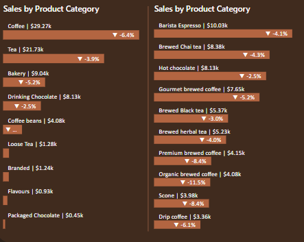
new MoM Label =
VAR diff = [CM Sales] - [PM Sales]
VAR mom  = diff / [PM Sales]
RETURN IF(diff > 0, "▲ ", "▼ ") & FORMAT(mom, "#0.0%")
Weekday / Weekend =
IF(
  'Date Table'[DayName] = "Sat" || 'Date Table'[DayName] = "Sun",
  "Weekend",
  "Weekday"
)Sales consistently surge between 7 AM and 10 AM on Saturdays and Sundays. Targeted "brunch specials"—limited-time food bundles or drink pairings—could capitalize on this foot traffic surge and further increase average ticket value.
Coffee and Tea together contribute more than three-quarters of all sales. Strategic efforts should focus on deeper differentiation within these two heavy-hitting categories rather than attempting to elevate underperforming categories.
Barista Espresso, Brewed Chai Tea, Hot Chocolate, and Gourmet Brewed Coffee solidly lead all other products. Promotional calendars should lean on these four best sellers to maximize incremental sales.
From January through May 2023, the top six products held exact positions month over month. In June, Gourmet Brewed Coffee moved from fourth to third and Brewed Herbal Tea ascended from sixth to fifth—signals that seasonal variants can quickly alter ranking patterns.
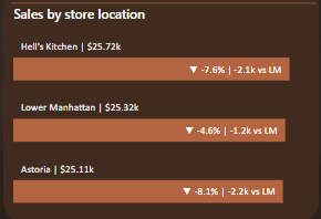
Hell's Kitchen has been No. 1 in sales for all six months, underscoring strong local loyalty. Marketing spend should protect Hell's Kitchen's position (e.g., loyalty-member perks) while aiming to stabilize revenue for mid-ranked locations.
Sales fall below average during both the first seven days and the final three days of each month — a typical pay-cycle pattern. Strategic "first-week" or "last-week" promotions could smooth revenue and prevent abrupt troughs at period boundaries.
Download the Power BI Desktop file with embedded report and model.
Get Power BI FileFor full technical documentation and implementation details, all queries, measures, and the dataset are hosted on GitHub:
View Repository