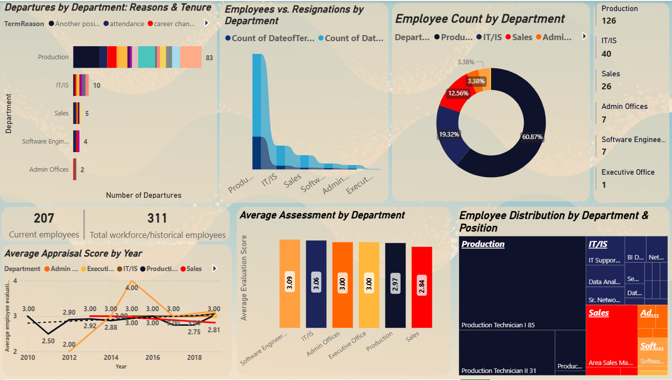
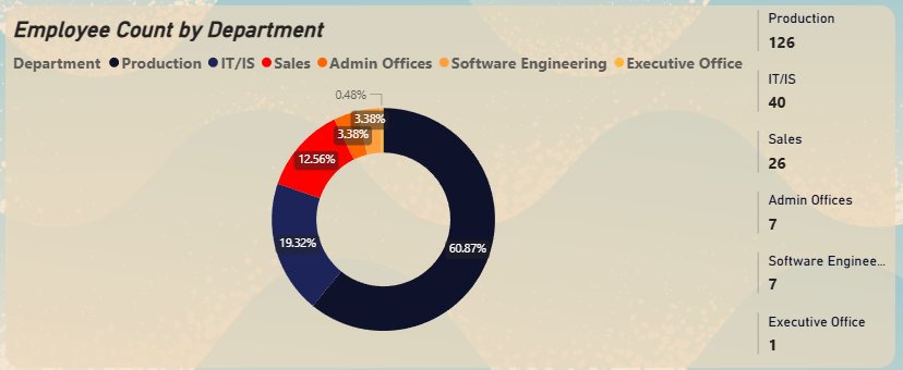
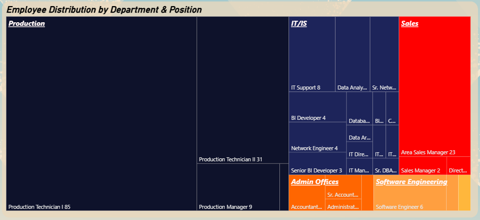
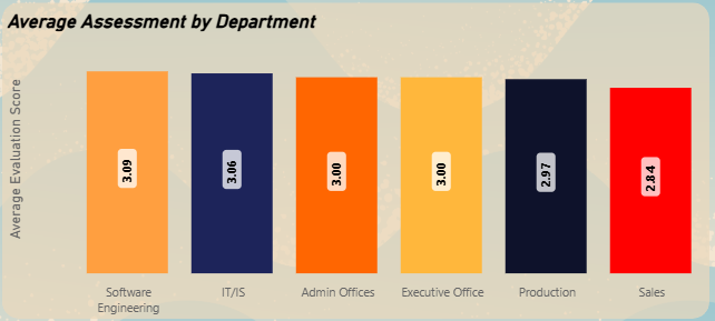
HR Analytics for Organizational Restructuring
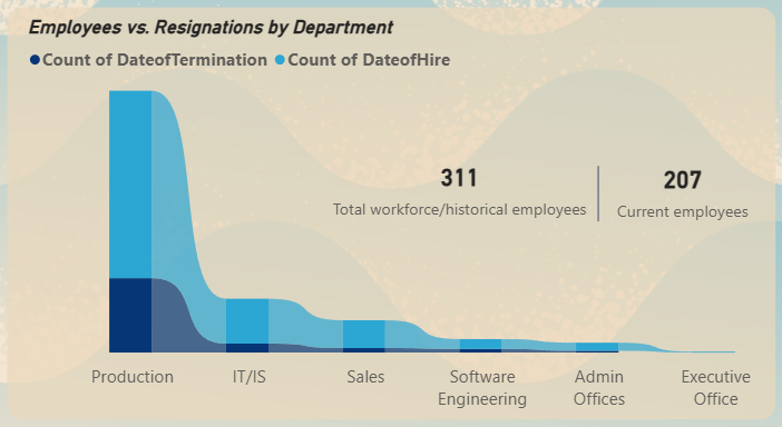
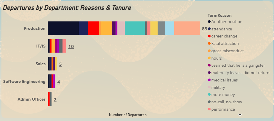
This Power BI dashboard analyses a comprehensive Human Resources dataset to identify key drivers of employee turnover and performance disparities across departments, with critical findings about the Production department.