📌 Project Overview
This project demonstrates a complete Business Intelligence workflow using Power BI with a premium design theme, showing real-world data transformation, advanced DAX formulas, professional dashboard design, and interactive analytics.
Project Objectives
- Data Cleansing: Validate and verify data integrity using Power Query
- Data Modeling: Create dimensional models with measures and calculated columns
- Advanced Analytics: Develop complex DAX formulas for KPIs and metrics
- Visualization: Design interactive charts and dashboards
- Interactivity: Implement filters and slicers for user exploration
📂 Dataset Information & Download
Source: Excel BI Analytics - Sample Sales Datasets
File Name: 50000-Sales-Records.csv (from 100 to 5M+ variations available)
Records: 50,000+ Sales Transactions | Data Range: 2010 - 2017 | Regions: Global Coverage
Data Structure & Columns
| Column Name | Data Type | Description | Sample Values |
|---|---|---|---|
| Region | Text | Geographic regions globally | Sub-Saharan Africa, Europe, Asia |
| Country | Text | Individual countries within regions | Namibia, Iceland, Russia, Indonesia |
| Item Type | Text | Product categories | Household, Baby Food, Meat, Cosmetics |
| Sales Channel | Text | Distribution method | Online, Offline |
| Order Priority | Text | Priority level (Critical, High, Med, Low) | C, H, M, L |
| Order Date | Date | Date of order placement | 8/31/2015, 11/20/2010 |
| Order ID | Text | Unique order identifier | 897751939, 599480426 |
| Ship Date | Date | Date of shipment | 10/12/2015, 1/9/2011 |
| Units Sold | Number | Quantity of units sold | 3604, 8435, 4848 |
| Unit Price | Currency | Price per unit | 668.27, 255.28, 421.89 |
| Unit Cost | Currency | Cost per unit | 502.54, 159.42, 364.69 |
| Total Revenue | Currency | Units Sold × Unit Price | 2,408,445.08, 2,153,286.80 |
| Total Cost | Currency | Units Sold × Unit Cost | 1,811,154.16, 1,344,707.70 |
| Total Profit | Currency | Total Revenue - Total Cost | 597,290.92, 808,579.10 |
Data Dimensions
🎨 Design Theme & Color Palette
A sophisticated, professional theme with carefully selected navy blues, vibrant oranges, and accent greens for optimal visual hierarchy and data readability.
Theme Download
Theme File: PowerBI_Premium_Elite_Theme.json
GitHub Repository: Power BI Workshop - Premium Elite Theme
How to Apply:
- Download the PowerBI_Premium_Elite_Theme.json file
- Open Power BI Desktop → View → Themes → Browse for themes
- Select the downloaded JSON file
- Theme applies automatically to all visuals
Color Palette (12-Color Scheme)
| Position | Color Code | Color Name | Purpose |
|---|---|---|---|
| 1 | #0F3B66 | Deep Navy | Primary background, major elements |
| 2 | #FF6B35 | Orange | Distributed accent, category 1 |
| 3 | #2A5A8C | Navy Blue | Secondary blue, visual hierarchy |
| 4 | #E85A2A | Orange | Distributed accent, category 2 |
| 5 | #3A6BA0 | Navy Blue | Tertiary blue, data visualization |
| 6 | #FF7D4D | Orange | Distributed accent, category 3 |
| 7 | #4A7CB4 | Navy Blue | Quaternary blue, subtle elements |
| 8 | #2ECC71 | Green | Distributed accent, positive/growth |
| 9 | #5A8DC8 | Navy Blue | Light blue, hover states |
| 10 | #27AE60 | Green | Distributed accent, success indicators |
| 11 | #6B9EDC | Navy Blue | Light blue, secondary data series |
| 12 | #1E4D7B | Navy Blue | Dark navy, borders and lines |
Dashboard Design Specifications
- Page Background Color: #F7F9FC (Almost White - neutral, clean backdrop)
- Chart Rectangle Backgrounds: #E8F0F8 (Light Blue - subtle visual grouping)
- Rectangle Borders: 1px solid #0B2C4D (Dark Navy - clean definition)
- Rounded Corners: 8px (soft, modern appearance)
- Visual Hierarchy: Rectangles behind charts create distinct zones
Step 1: Insert Rectangles
- Insert → Shapes → Rectangle (for each visual grouping)
- Position behind KPI cards, charts, and table sections
- Size to encompass related visualizations
Step 2: Format Rectangles
- Fill: Solid color → #E8F0F8 (Light Blue)
- Border: Solid line, 1px, #0B2C4D (Dark Navy)
- Shadow: None (keep clean)
- Transparency: 0% (full opacity)
Step 3: Arrange Layers
- Right-click rectangle → Send backward (behind charts)
- Ensure all visuals appear on top of rectangles
- Create visual zones: KPI zone, chart zone, table zone
🧹 Data Preparation & Cleansing
Action: Download and import the Sales Records CSV file into Power BI Desktop
- Download Source: Excel BI Analytics Sample Datasets
- Recommended File: 50000-Sales-Records.csv or higher
Import Steps:
- Open Power BI Desktop → Get Data → Text/CSV
- Navigate to and select the CSV file
- Power BI automatically detects columns and data types
- Click Load to import data into the Data Model
Action: Open Power Query (Transform Data) to verify data integrity
Data Quality Checks:
- Column Profile View: View column quality statistics
- Go to Home → Data Profiling → Column Quality
- Displays: Valid %, Error %, Empty % for each column
- All columns show 100% Valid data
- No null values or data anomalies detected
- Distribution Analysis: Examine data distribution
- Review unique values in categorical columns
- Verify numeric ranges are reasonable
- Check date ranges fall within expected timeline
- Filtering & Sorting: Test data integrity
- Apply filters on each column to check data consistency
- Sort columns to identify outliers
- Verify no anomalies or unexpected values exist
Action: Create a dedicated dimension table for measures and aggregations
Process:
- Duplicate the main table '50000 Sales Records'
- Rename original table appropriately (e.g., 'Sales Data', 'Sales Records')
- Remove duplicate rows based on Region column
- Rename the table to 'Key Measure'
- This table will host all DAX measures and calculations
Key Measure table contains unique regions and serves as the measure host for all KPI calculations and aggregations used throughout the dashboard.
- ✓ Step 1: CSV file successfully imported from Excel BI Analytics source
- ✓ Step 2: All columns validated at 100% quality (no nulls)
- ✓ Step 3: Data consistency verified through Power Query
- ✓ Step 4: Dimension table created for measure aggregation
- ✓ Step 5: Data model optimized and ready for measure creation
- ✓ Step 6: Ready to proceed to DAX measure development
📐 Measures & DAX Formulas
Measure Development Steps
Right-click 'Key Measure' table → New Measure
Enter the formula code provided below
Select measure → Measure Tools → Format dropdown
Choose: Whole Number, Decimal, Currency, or Percentage as appropriate
Add measure to a card visualization to verify calculation
Test with different filters to ensure context-awareness
Core Financial Measures
Current Month (CM) Measures
Purpose: Isolates total revenue for the current month context
Formula Logic: CALCULATE modifies filter context to evaluate Total Revenue at the month level
Use Case: Basis for month-over-month revenue comparisons
Data Type: Date dimension must have Month hierarchy enabled
Purpose: Calculates total costs for the current month
Formula Logic: CALCULATE filters Total Costs to current month only
Use Case: Month-specific cost analysis and tracking
Purpose: Isolates profit for the current month context
Formula Logic: CALCULATE modifies filter context to evaluate Total Profit at the month level
Use Case: Basis for month-over-month profit comparisons
Purpose: Shows profitability ratio for the current month
Formula Logic: Filters Profit Margin % calculation to current month only
Use Case: Track margin trends across months
Total Financial Measures
Purpose: Calculates total revenue generated across all orders
Formula Logic: SUMX multiplies Units Sold by Unit Price for each row, then sums all products
Use Case: Primary KPI showing total income from sales
Recalculates On: Any filter changes (Region, Date, Channel, Item Type)
Purpose: Calculates total cost of goods sold (COGS)
Formula Logic: SUMX multiplies Units Sold by Unit Cost for each row, then sums all products
Use Case: KPI showing total operational costs
Recalculates On: Any filter changes in the data model
Purpose: Calculates net profit (Revenue minus Costs)
Formula Logic: Subtracts Total Costs from Total Revenue
Use Case: Primary profitability KPI for business performance
Important: This formula references other measures, enabling complex calculations
Purpose: Calculates profit margin as percentage of revenue
Formula Logic: Divides Total Profit by Total Revenue with 0 as error handler
Use Case: Shows profitability ratio and efficiency metrics
DIVIDE Function: Third parameter (0) prevents errors when denominator is zero
Format: Display as percentage in card visualization
Previous Month (PM) Measures
Purpose: Gets revenue from one month prior for comparison
Formula Logic: DATEADD shifts the date context back one month
Use Case: Enables month-over-month growth calculations
Purpose: Gets costs from one month prior
Formula Logic: DATEADD shifts date context back one month from CM Costs
Use Case: Cost comparison and trend analysis
Purpose: Gets profit from one month prior for comparison
Formula Logic: DATEADD shifts the date context back one month
Use Case: Enables month-over-month growth calculations
Purpose: Gets profit margin from one month prior
Formula Logic: Filters CM Profit Margin % to previous month
Use Case: Margin trend analysis and comparison
Advanced Time-Based Measures
Month-over-Month (MoM) Growth Measures
Purpose: Shows month-over-month revenue growth with visual indicators
Format Output: "▲ +12.50% | +150.3k vs LM" (vs LM = vs Last Month)
Components: Percentage change, absolute difference, trend arrows
Purpose: Shows month-over-month cost growth with visual indicators
Format Output: "▼ -8.20% | -85.2k vs LM" (negative is good for costs)
Key Insight: Tracks cost management and operational efficiency trends
Purpose: Complex measure showing month-over-month profit growth with visual indicators
Components:
- MonthDiff: Absolute profit difference from previous month
- MoM: Percentage change calculation
- Sign/SignTrend: Visual indicators (▲▼ and +/-)
Output Format: "▲ +15.42% | +250.5k vs LM"
Use Case: Primary performance indicator for month-over-month profitability trends
Purpose: Shows month-over-month change in profit margin percentage
Format Output: "+0.5% vs LM" (percentage point change)
Key Insight: Tracks margin efficiency trends and pricing power
Purpose: Calculates the average profit across all selected dates for use as a constant reference line on column charts
Formula Logic: AVERAGEX iterates through all dates in the current filter context (ALLSELECTED), calculating profit for each, then averages them
Chart Implementation: Add this measure as a secondary Y-axis on the Stacked Column Chart showing Profit by Day
Visual Effect: Creates a horizontal benchmark line showing average profit level - users can quickly see which days exceed or fall below average performance
Use Case: Helps identify peak profit days and underperforming days at a glance. Provides immediate context for daily performance analysis
| Measure | Type | Purpose |
|---|---|---|
| Core Financial Measures | ||
| Total Revenue | Financial | Total sales income across all filters |
| Total Costs | Financial | Total operational costs |
| Total Profit | Financial | Net profitability (Revenue - Costs) |
| Profit Margin % | Ratio | Profitability percentage of revenue |
| Current Month (CM) Measures | ||
| CM Revenue | Time-Based | Current month revenue only |
| CM Costs | Time-Based | Current month costs only |
| CM Profit | Time-Based | Current month profit |
| CM Profit Margin % | Time-Based | Current month margin percentage |
| Previous Month (PM) Measures | ||
| PM Revenue | Time-Based | Previous month revenue |
| PM Costs | Time-Based | Previous month costs |
| PM Profit | Time-Based | Previous month profit |
| PM Profit Margin % | Time-Based | Previous month margin |
| Month-over-Month (MoM) Growth Measures | ||
| MoM Growth & Diff Revenue | Growth | Revenue % change + absolute difference vs LM |
| MoM Growth & Diff Costs | Growth | Cost % change + absolute difference vs LM |
| MoM Growth & Diff Profit | Growth | Profit % change + absolute difference vs LM |
| MoM Growth & Diff Profit Margin % | Growth | Margin percentage point change vs LM |
📊 Visualization Types & Design Patterns
KPI Cards
💰 Total Revenue Card
Data: [Total Revenue] Measure
Format: Millions with currency symbol ($)
Visual Enhancement: Left accent bar (teal color)
Purpose: At-a-glance view of total sales income; immediately shows business scale
Interactivity: Updates dynamically based on selected filters
📊 Total Costs Card
Data: [Total Costs] Measure
Format: Millions with currency symbol ($)
Visual Enhancement: Left accent bar (orange color)
Purpose: Shows operational costs; used for comparing with revenue
Interactivity: Responds to all dashboard filters
📈 Total Profit Card
Data: [Total Profit] Measure
Format: Millions with currency symbol ($)
Visual Enhancement: Left accent bar (green color)
Purpose: Key profitability indicator; shows bottom-line performance
Interactivity: Central KPI that drives analysis
% Profit Margin % Card
Data: [Profit Margin %] Measure
Format: Percentage (0-100%)
Visual Enhancement: Left accent bar (blue color)
Purpose: Shows efficiency and profitability ratio
Interactivity: Normalized metric for comparison
Distribution & Composition Charts
🍩 Donut Chart - Revenue by Sales Channel
Legend: Sales Channel (Online, Offline)
Values: Total Revenue by Channel
Purpose: Shows revenue distribution between sales channels
Insights: Compares online vs offline sales performance
Interactivity: Click slices to drill or cross-filter
Why Donut: Excellent for showing part-to-whole relationships with 2-3 categories
Comparative & Trend Charts
📊 Stacked Bar Chart - Profit by Region (Enhanced)
Axis (Y): Region
Values: Total Profit (Stacked)
Drill Target: Country level
Tooltips: Enhanced with Profit Margin (%) and MoM Growth & Diff Profit
Purpose: Compare regional profitability with margin and growth analysis
Interactive Features: Drill to countries + hover for margin & MoM comparison
Categorical & Hierarchical Charts
🌳 Treemap - Profit by Item Type (Enhanced)
Groups: Item Type (14+ product categories)
Values: Total Profit
Color: Profit Margin % (gradient visualization)
Tooltips: Enhanced with Profit Margin (%) and MoM Growth & Diff Profit
Purpose: Show profit distribution across product categories with margin and trend analysis
Insights: Rectangle size = profit volume; Color = profitability; Tooltip = margin + growth
Interactive Value: Hover to see previous month comparison and MoM growth trend
📊 Stacked Column Chart - Units Sold by Item Type (Enhanced)
Axis (X): Item Type
Values: Units Sold (Sum)
Tooltips: Enhanced with MoM Growth & Diff Sales (Units Sold basis)
Purpose: Show sales volume by product category with growth metrics
Insights: Bar height = volume; Tooltip = volume trend comparison
Complementary Role: Combines with Treemap to show volume vs. profitability; tooltip shows growth
- KPI Cards: Immediate performance overview
- Donut Chart: Part-to-whole for binary data (Online/Offline)
- Stacked Bar: Hierarchical comparison with drill capability
- Treemap: Multi-dimensional analysis for many categories
- Stacked Column: Volume trends across categories
🎨 Dashboard Build & Assembly
Objective: Create four key metric cards for executive summary
Steps:
- Insert Card visualization for Total Revenue
- Drag [Total Revenue] measure to Fields
- Format as millions (M) in Measure Tools
- Apply currency formatting ($)
- Add left accent bar (teal) for visual interest
- Duplicate and modify for Total Costs
- Copy the Revenue card
- Replace measure with [Total Costs]
- Change accent color to orange
- Create Total Profit card
- Insert new Card visualization
- Add [Total Profit] measure
- Format as millions with currency
- Green accent bar for profitability indicator
- Create Profit Margin % card
- Insert Card visualization
- Add [Profit Margin %] measure
- Format as percentage
- Blue accent bar
Dashboard Progress: 25%
Objective: Visualize revenue split between sales channels
Steps:
- Insert Donut Chart visualization
- Configure chart data
- Legend (Details): Sales Channel
- Values: Total Revenue
- Formatting options
- Add data labels showing percentage
- Customize colors to match color scheme
- Add title "Revenue by Sales Channel"
- Enable tooltips for detail information
Dashboard Progress: 45%
Objective: Show regional performance with country-level drill
Steps:
- Insert Stacked Bar Chart visualization
- Configure hierarchy
- Axis (Y): Region
- Values: Total Profit (stacked)
- Enable drill functionality
- Right-click chart → Drill Settings
- Add Country as drill-down level
- Users can click region to expand country details
- Formatting
- Format values as thousands (K)
- Sort regions by profit descending
- Add title "Profit by Region (Click to Drill)"
Dashboard Progress: 60%
Objective: Display profit distribution across product categories
Steps:
- Insert Treemap visualization
- Configure data fields
- Group: Item Type
- Values: Total Profit
- Color Saturation: Profit Margin %
- Visual configuration
- Enable data labels (show Item Type names)
- Apply color gradient from red (low margin) to green (high margin)
- Add title "Profit by Item Type (Color = Margin %)"
- Tooltip enhancement
- Include Item Type, Profit, Margin % in tooltip
Dashboard Progress: 75%
Objective: Show unit sales volume by product type
Steps:
- Insert Stacked Column Chart visualization
- Configure data
- Axis (X): Item Type
- Values: Units Sold (Sum)
- Formatting
- Format y-axis as thousands (K) for readability
- Sort categories by units sold descending
- Add title "Units Sold by Item Type"
- Enable data labels on top of bars
- Contextual note
- This chart shows volume; compare with Treemap for profitability insights
- High volume ≠ High profit (price and margin differences)
Dashboard Progress: 85%
- Top Row: Four KPI cards (Revenue, Costs, Profit, Margin %)
- Middle Row: Donut Chart (Revenue by Channel) + Stacked Bar (Profit by Region)
- Bottom Row: Treemap (Profit by Item Type) + Stacked Column (Units Sold)
- Filters: Positioned above or on left side for easy access
🔍 Filters & Interactivity
Year Filter (Dropdown Slicer)
📅 Year Slicer Configuration
Type: Dropdown Slicer
Field: Order Date (Year hierarchy)
Values: 2010, 2011, 2012, 2013, 2014, 2015, 2016, 2017
Default Selection: All years (unfiltered view)
Purpose: Allows users to analyze annual trends and select specific years for comparison
Implementation Steps:
- Insert Slicer visualization
- Drag Order Date field to Slicer
- Change slicer style to Dropdown
- Right-click slicer → Slicer Settings
- Select "Dropdown" option
- Expand to Year level
- Click arrow next to "Order Date" → Select "Year"
- Positioning: Place at top of dashboard for easy access
Month Filter (Tile Slicer)
📅 Month Slicer Configuration
Type: Tile Slicer (List format)
Field: Order Date (Month hierarchy)
Values: January through December (12 tiles)
Default Selection: All months (unfiltered)
Purpose: Enables granular monthly analysis; works in conjunction with Year filter
Implementation Steps:
- Insert second Slicer visualization
- Drag Order Date field to this Slicer
- Set to Month level
- Click arrow → Select "Month"
- Change style to Tile
- Right-click slicer → Slicer Settings
- Select "Tile" layout option
- Adjust to show all 12 months horizontally
- Positioning: Place below Year filter
Filter Interaction Strategy
User clicks Year dropdown and selects a specific year (e.g., 2015)
- All visualizations update to show 2015 data
- Month slicer automatically shows only available months in that year
- KPI cards reflect year-specific values
User clicks on specific month tile (e.g., March)
- Dashboard filters down further to year + month combination
- All charts now show March 2015 data only
- Regional drill-down shows that month's performance
User clicks region in Stacked Bar chart to drill to countries
- Country-level details appear while maintaining Year + Month filters
- Multiple filter dimensions work in parallel
Advanced Filter Features
- Multi-select: Enable Ctrl+Click for multiple month selection (optional)
- Sync filters: All visualizations automatically respond to filter changes
- Clear filters: Add "Clear All" option for quick dashboard reset
- Default state: Keep "All" selected by default for maximum data view
- Mobile optimization: Ensure slicers are touch-friendly for tablet users
User Interaction Workflow
| User Action | Filter Applied | Dashboard Response |
|---|---|---|
| Select Year = 2015 | Order Date [Year] = 2015 | All visuals show 2015 data; KPIs recalculate |
| Select Month = March | Order Date [Year] = 2015 + [Month] = March | Drill to March 2015; Cards, charts update |
| Click Region = "Africa" | Year + Month + Region = "Africa" | Bar chart drills to African countries; maintain other filters |
| Clear Year filter | Remove Year = 2015 | Return to all years; March still filtered |
- ✓ Year dropdown slicer created and positioned
- ✓ Month tile slicer created and positioned
- ✓ Both slicers connected to Order Date field
- ✓ Regional drill-down enabled on Bar chart
- ✓ All visualizations respond to filter changes
- ✓ Dashboard provides clear visual feedback of active filters
- ✓ Users can easily reset to see full dataset
📈 Sales Insights by Month (2017 Analysis)
This section provides granular monthly insights showing seasonal patterns, performance drivers, and business trends throughout 2017. Each month is analyzed independently to show how filtering by month reveals specific business dynamics. All data extracted directly from Power BI dashboard filters and visualizations.
What does "pp" mean in Margin Change?
"pp" stands for percentage points - it's different from regular percentages.
Simple Example: If margin was 30% in January and 30.20% in February, the change is +0.20 pp (just the difference: 30.20 - 30 = 0.20)
Why this matters: When comparing percentages, we use "pp" to show the absolute difference between them. So +0.20 pp means it went up by exactly 0.20 percentage points.
What does "H1" and "H2" mean?
"H1" = first half of the year (January through June)
"H2" = second half of the year (July through December)
Example: "H1 2017 Total: $3,260.6M Revenue" means we're adding up revenue from all 6 months (Jan + Feb + Mar + Apr + May + Jun = H1)
Year 2017 Performance Overview
Monthly Performance Breakdown
Detailed monthly analysis extracted from Power BI dashboard showing Month-over-Month comparisons and key regional/product drivers
Q1 2017 (January - March)
📊 Performance: Revenue $700.6M | Profit $210.3M | Margin 30.01%
📈 Details: 2,706,289 units across 535 transactions
🏆 Top Drivers: Sub-Saharan Africa (Region) | Offline (Channel) | Cosmetics & Cereal (Products)
💡 Key Insight: Strong Q1 start with solid $700.6M revenue. January set baseline for 2017 performance with consistent 30% margin. Sub-Saharan Africa dominated regional performance with highest profit contribution.
📊 Performance: Revenue $694.5M | Profit $209.8M | Margin 30.21%
📈 Details: 2,488,645 units across 506 transactions | -0.88% Revenue MoM
🏆 Top Drivers: Europe (Region) | Online (Channel) | Household (Product)
💡 Key Insight: Slight seasonal dip in revenue (-0.88%) but margin improved to 30.21% (+0.20pp). Strong operational efficiency despite lower volume. Europe's online channel showing strong performance.
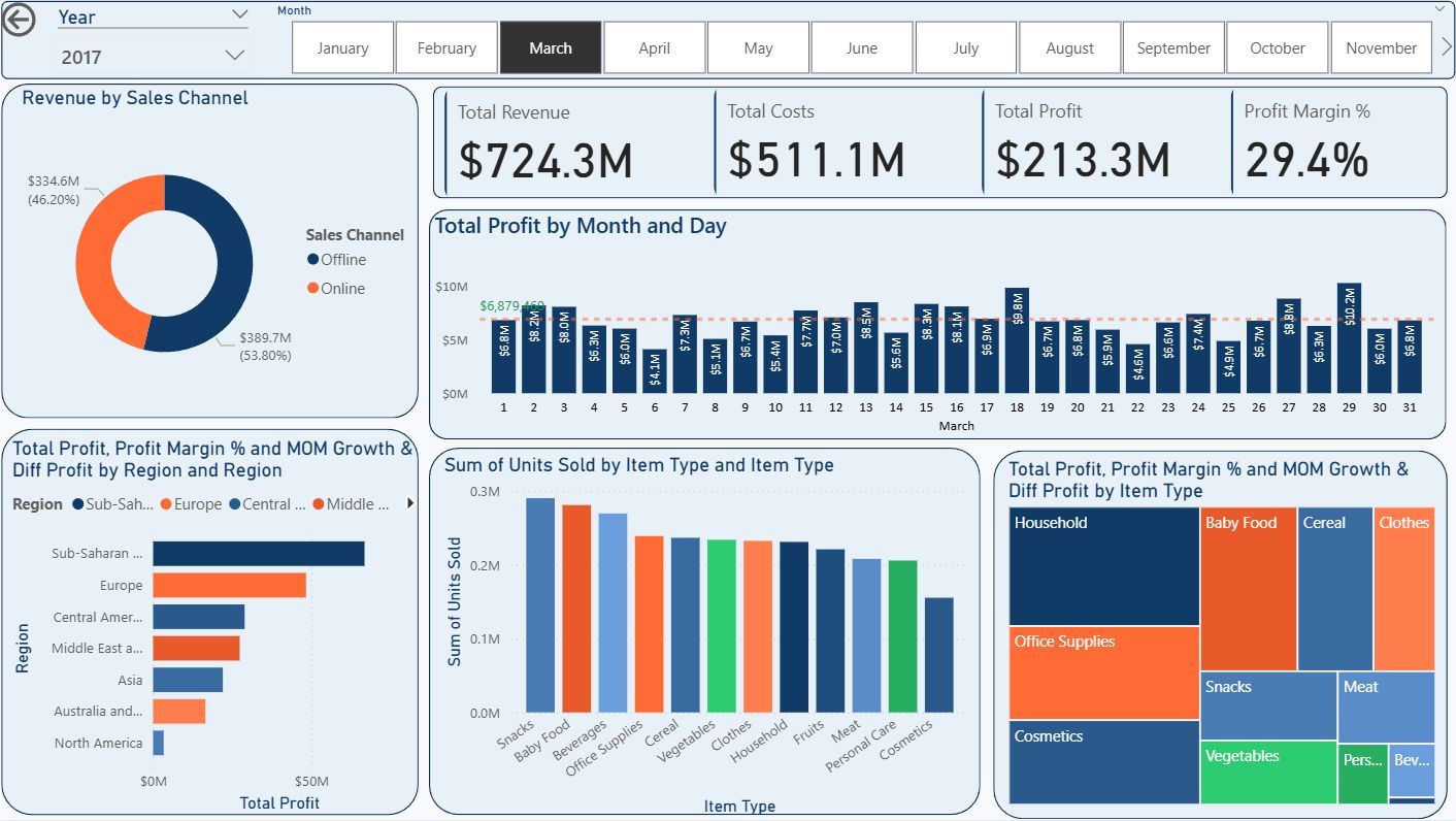
📊 Performance: Revenue $724.3M | Profit $213.3M | Margin 29.44%
📈 Details: 2,807,154 units across 563 transactions | +4.30% Revenue MoM, +1.66% Profit MoM
🏆 Top Drivers: Sub-Saharan Africa (Region) | Offline (Channel) | Clothes & Cereal (Products)
💡 Key Insight: Q1 closed strong with growth rebound. +4.3% revenue and +1.66% profit recovery. Highest unit volume in Q1 (2.8M). Product mix shift towards premium categories (Clothes 67% margin).
Q1 Total: $2,119.4M Revenue | $633.3M Profit | 29.89% Avg Margin
Q2 2017 (April - June)
📊 Performance: Revenue $664.7M | Profit $203.1M | Margin 30.56%
📉 Details: 2,649,917 units across 545 transactions | -8.23% Revenue MoM, -4.76% Profit MoM
🏆 Top Drivers: Europe (Region) | Offline (Channel) | Household (Product)
💡 Key Insight: Seasonal normalization in April with expected post-Q1 dip. However, margin improved significantly to 30.56% (+1.12pp), showing strong cost management. Spring buying patterns stabilizing.
📊 Performance: Revenue $790.1M | Profit $231.1M | Margin 29.25%
📈 Details: 2,971,572 units across 610 transactions | +18.86% Revenue MoM, +13.78% Profit MoM
🏆 Top Drivers: Sub-Saharan Africa (Region) | Online (Channel) | Cereal (Product)
💡 Key Insight: Strongest month of first half with +18.86% revenue surge. May's powerful recovery signals mid-year momentum building. Record transaction volume (610). Online channel acceleration evident in African markets.
📊 Performance: Revenue $686.3M | Profit $208.4M | Margin 30.37%
📈 Details: 2,702,702 units across 536 transactions | -13.13% Revenue MoM, -9.81% Profit MoM
🏆 Top Drivers: Australia & Oceania (Region) | Offline (Channel) | Cosmetics (Product)
💡 Key Insight: Post-May normalization with expected pullback. Margin recovery to 30.37% (+1.12pp) shows operational discipline. Q2 closed with solid $2.1B revenue base despite June dip. Premium products (Cosmetics) maintaining margin strength.
Q2 Total: $2,141.2M Revenue | $642.6M Profit | 30.06% Avg Margin - May Drove Strong Recovery
H2 2017 (July Onwards) - Summer Momentum
📊 Performance: Revenue $649.3M | Profit $192.6M | Margin 29.67%
📈 Details: 2,404,223 units across 480 transactions | -5.40% Revenue MoM, -7.58% Profit MoM
🏆 Top Drivers: Sub-Saharan Africa (Region) | Online (Channel) | Cosmetics (Product)
💡 Key Insight: H2 transition month with expected June-July normalization. Despite revenue dip, maintained solid 29.67% margin. Lower transaction volume (480) suggests selective high-value orders. Cosmetics margin strength at 39.77% driving profitability.
💡 2017 Performance Summary
- May Peak: May 2017 delivered the strongest performance with $790.1M revenue (+18.86% MoM) and record 610 transactions
- Margin Consistency: Despite varying revenue, profit margins maintained 29-30% range throughout H1, showing strong operational control
- Regional Leadership: Sub-Saharan Africa consistently led with $1.35B annual revenue (29.34% margin) and 5M+ units
- Channel Performance: Offline channel generated $2.61B (49% of total) vs Online $2.30B, both with comparable margins (~30%)
- Product Mix: Premium categories (Clothes 67.2%, Cereal 43.1%, Cosmetics 39.8%) drove high margins, while Meat (13.6%) and Office Supplies (19.4%) showed lower profitability
- Volume Leadership: Highest unit volume in March (2.8M) and May (3.0M) coinciding with revenue peaks
H1 2017 Total: $3,260.6M Revenue | $975.9M Profit | 29.94% Avg Margin
📊 Key Findings - Simple Summary
Month-over-Month Growth Analysis (2017 H1)
| Period | Revenue Change | Profit Change | Margin Change | Assessment |
|---|---|---|---|---|
| Jan → Feb | -0.88% | -0.23% | +0.20pp | Minimal dip with margin improvement |
| Feb → Mar | +4.30% | +1.66% | -0.77pp | Growth with product mix shift |
| Mar → Apr | -8.23% | -4.76% | +1.12pp | April dip offset by margin expansion |
| Apr → May | +18.86% | +13.78% | -1.31pp | Strong recovery - May peak driven by volume |
| May → Jun | -13.13% | -9.81% | +1.12pp | Post-May normalization with margin recovery |
| Jun → Jul | -5.40% | -7.58% | -0.70pp | H2 transition with continued adjustment |
💡 Actionable Recommendations - Simple Summary
✅ Project Completion Summary
Dashboard Components Overview
A complete, production-ready Business Intelligence dashboard with multi-dimensional analysis capabilities
Implementation Checklist
Project Completion: 100%
| Component | Status | Details |
|---|---|---|
| Data Import | ✓ Complete | 50,000 records from CSV file loaded |
| Data Validation | ✓ Complete | 100% data quality verified; no nulls or anomalies |
| Data Modeling | ✓ Complete | Key Measure dimension table created with unique regions |
| DAX Measures | ✓ Complete | 8 measures created (Revenue, Costs, Profit, Margin %, MoM Growth, etc.) |
| KPI Cards | ✓ Complete | 4 cards: Total Revenue, Total Costs, Total Profit, Profit Margin % |
| Donut Chart | ✓ Complete | Revenue distribution by Sales Channel (Online/Offline) |
| Stacked Bar Chart | ✓ Complete | Profit by Region with drill-down to Country level |
| Treemap | ✓ Complete | Profit by Item Type with Margin % color coding |
| Stacked Column | ✓ Complete | Units Sold by Item Type for volume analysis |
| Year Filter | ✓ Complete | Dropdown slicer for selecting 2010-2017 timeframe |
| Month Filter | ✓ Complete | Tile slicer for month-level granularity |
| Dashboard Layout | ✓ Complete | Professional multi-row layout with organized visualizations |
Key Achievements
Skills Demonstrated
- Data Preparation: CSV import, quality validation, data cleansing
- Power Query: Data transformation, duplicate removal, table management
- DAX Expertise: Advanced formulas including SUMX, CALCULATE, AVERAGEX, DATEADD, DIVIDE
- Visualization Design: Multiple chart types for different analytical purposes
- Dashboard Architecture: KPI layout, interactive elements, user experience design
- Measure Development: Financial metrics, time-based analysis, growth calculations
- Interactivity: Slicers, drill-downs, cross-filtering
- Business Intelligence: End-to-end BI pipeline from data to insight
Learning Outcomes for Students
- How to import and validate real-world datasets
- Best practices for data modeling in Power BI
- Writing complex DAX formulas for business metrics
- Choosing appropriate visualizations for different data types
- Designing professional, interactive dashboards
- Implementing filters for exploratory analysis
- Creating reusable measurement frameworks
- Translating business requirements into technical implementations
Next Steps & Enhancement Ideas
- Add forecasting models using Time Series analysis
- Create RLS (Row-Level Security) for regional managers
- Implement drill-through actions for detailed transaction analysis
- Add sentiment analysis on customer feedback
- Create mobile-optimized dashboard layouts
- Integrate with real-time data sources (APIs)
- Develop performance indicators with benchmarking
- Create AI-powered anomaly detection
Documentation for Your Students
This guide provides step-by-step instructions for recreating the entire project. Students can:
- Follow sections sequentially from Data Preparation through Filters
- Reference specific formulas when implementing measures
- Understand the reasoning behind visualization choices
- Learn dashboard layout best practices
- Adapt the project to their own datasets
- Build upon this foundation with advanced techniques
Project Status: Production Ready ✓
This dashboard is suitable for presentation to stakeholders, executives, or as a portfolio piece
demonstrating Business Intelligence competency.