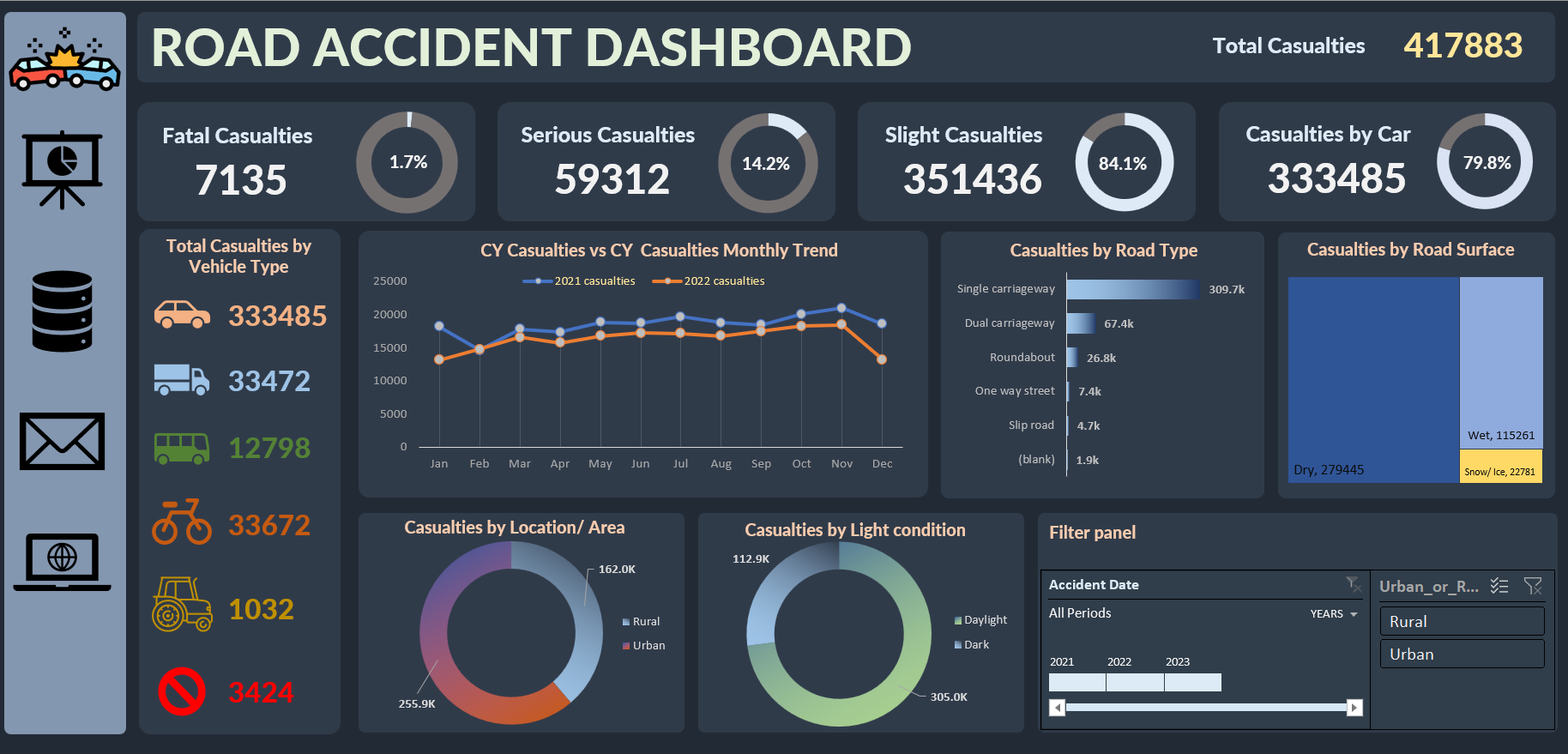
Road Accident Dashboard
This project transforms raw accident data into actionable insights, identifying high-risk zones, vehicle impact, and temporal trends to enhance road safety and inform data-driven policy decisions.
This project transforms raw accident data into actionable insights, identifying high-risk zones, vehicle impact, and temporal trends to enhance road safety and inform data-driven policy decisions.
Traffic accidents impose enormous costs — not just economically, but also in human lives. This project aims to harness the power of data to transform raw road accident records into actionable insights. By analysing accident severity, vehicle types, environmental conditions, and temporal trends, the dashboard provides a clear picture of high-risk areas and periods, enabling targeted interventions to improve road safety.
The project begins with a deep dive into the raw data, which includes over 307,000 rows across 21 fields sourced from Kaggle. The data is meticulously scrubbed and transformed — errors are corrected, dates are standardised, and new columns (such as Month and Year) are derived.
Detailed PivotTables are then used to compute key metrics, and individual visualisations (Donut Charts, Line Charts, Treemaps) are built on dedicated worksheets. These visualisations are ultimately integrated into an interactive, comprehensive dashboard that allows users to drill down from annual trends to granular insights.
Watch the dashboard in action — demonstrating real-time filtering and responsive visualisation capabilities:
Road Accident Dashboard: Overall Project Overview
The Road Accident Dashboard is a data visualisation project built to analyse and interpret synthetic road accident data for the years 2021 and 2022. Using an artificial dataset sourced from Kaggle, this project processes over 307,000 rows (handling up to 3.07 million records) across 21 fields, offering a comprehensive view into traffic incidents. The dashboard is designed to reveal patterns in accident severity, vehicle involvement, road and environmental conditions, and temporal trends, transforming raw data into actionable insights for stakeholders.
Traffic accidents have profound social and economic impacts. By converting complex datasets into clear visual narratives, this dashboard equips key stakeholders — including government agencies, law enforcement, emergency services, and the general public — with the insights needed to drive policy changes, improve road safety, and ultimately reduce the number of accidents and casualties.
For implementation details and technical documentation:
View Full RepositoryGETPIVOTDATA(), e.g., =GETPIVOTDATA("Sum of Casualties", $A$3, "Severity", "Fatal")SUMIFS(), and quick lookups using XLOOKUP().